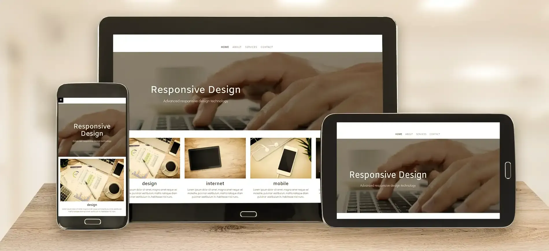
What is Responsive Web Design?
In the digital age, where people access websites from a variety of devices and screen sizes, having a website that works seamlessly across platforms is no longer optional—it’s essential. This is where responsive web design (RWD) comes into play. But what exactly is responsive web design, and why is it so important for businesses in Houston, The Woodlands, and beyond? In this blog, we’ll break down the concept, explore its importance, and discuss how you can leverage it to improve your online presence.
Introduction to Responsive Web Design
Responsive web design is a design approach that ensures websites adapt dynamically to different screen sizes and orientations. Whether your visitors are using a desktop, tablet, or smartphone, responsive websites adjust their layout and content to provide an optimal viewing and interaction experience.
Examples of Responsive Web Design
See How WSI Urdaneta Group Makes Websites Work Across All Devices
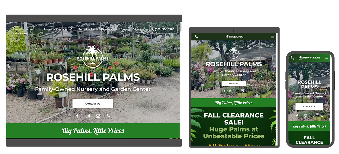
Rosehill Palms
Family-Owned Nursery and Garden Center
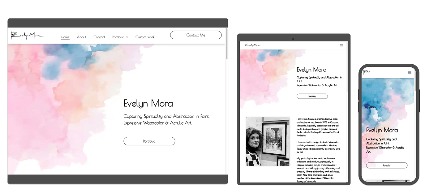
Evelyn Mora
Watercolor Artist

Adriana's Business Solutions
Tax and Business Consulting

Universal Sign and Graphics
Outdoor and Indoor Custom Business Signage
Why is Responsive Web Design Important
Responsive web design is vital in today’s mobile-first world, not only for user experience but also for search engine optimization (SEO).
- Mobile-First Indexing: Google prioritizes mobile-friendly websites in its rankings. If your site isn’t responsive, you risk falling behind competitors in search results.
- Enhanced User Experience: A responsive website ensures visitors can easily navigate and interact with your content, regardless of the device they use. This reduces bounce rates and increases time spent on your site.
- Increased Reach: Responsive design makes your site accessible to a broader audience, catering to users on all devices.
- AI Visibility: If your site doesn't rank in Google, it will be very difficult to be considered by AI LLMs.
Does Your Website Need to Be Responsive?
The short answer: Yes.
About 75% of potential customers search for local companies on their smartphones; in Houston and The Woodlands, some industries exceed 80%. A non-responsive website not only frustrates users but also harms your brand reputation and SEO performance.
How Responsive Websites Work
Responsive websites rely on advanced techniques to ensure seamless adaptation across devices.
Fluid Grid Layouts
A fluid grid layout is the backbone of responsive web design. Unlike fixed layouts, fluid grids use relative sizing–like percentages rather than fixed units like pixels–enabling elements to resize proportionally based on the screen size. This ensures that your website's structure remains intact, whether viewed on a large monitor or a small phone screen.
Media Queries
Media queries are CSS rules that apply different styles based on device characteristics. For example, a three-column desktop layout might become a single-column layout on a smartphone, ensuring the content remains readable.
Flexible Images and Media
Images and videos can adjust their size and resolution based on the device being used.
Importance of Mobile-Friendly Design
With mobile devices accounting for over 50% of global web traffic, having a mobile-friendly design is non-negotiable. A responsive site guarantees that buttons are tappable, fonts are legible, and navigation is intuitive on smaller screens.
Common Practices in Responsive Web Design
Designers and developers follow these best practices to create responsive websites:
- Prioritize Content: Display the most crucial content first for smaller screens, ensuring users can find what they need quickly.
- Use Scalable Vector Graphics (SVGs): SVGs ensure images look sharp on all devices without compromising load speed.
- Adopt a Mobile-First Approach: Start by designing for smaller screens and scale up to larger screens, rather than the other way around.
- Optimize Loading Speed: Compress images, minimize code, and leverage caching to ensure fast load times across devices.
Benefits of Responsive Web Design
Responsive web design offers a wealth of benefits, including:
- Improved SEO: Google’s algorithms favor mobile-friendly, responsive websites, giving you a better chance of ranking higher in search results.
- Cost-Efficiency: A single responsive website is easier and cheaper to maintain compared to managing separate desktop and mobile versions.
- Higher Conversion Rates: A seamless user experience across devices reduces friction and encourages users to take action, whether it’s making a purchase or filling out a contact form.
- Future-Proofing: As new devices with varying screen sizes emerge, a responsive design ensures your website stays relevant and functional.
Future of Web Design
Responsive web design isn’t just a trend—it’s the foundation of modern web development. As the digital landscape evolves, websites must be flexible enough to meet users’ needs on all devices. For Houston businesses, adopting responsive web design can significantly improve user experience, boost SEO, and enhance your overall online presence.
At WSI Urdaneta Group, we ensure that every website we develop is fully responsive and specifically optimized for Greater Houston mobile users. Whether your customers are browsing on smartphones, tablets, or desktop computers, they'll enjoy seamless navigation and perfect visibility of your content.
Ready to enhance your digital presence? WSI Urdaneta Group specializes in creating SEO-friendly websites tailored to your business needs. Contact us today to get started!
The Best Digital Marketing Insight and Advice
Our Blog is a great place to get tips, tricks, and best practices on all things digital marketing in Houston. Subscribe and get our posts as soon as they are published.
Subscribe Blog
For information on our privacy practices and commitment to protecting your privacy, check out our Privacy Policy and Cookie Policy.
Don't stop the learning now!